Blog Design

Design Basics
On one level, blog design is an art form. It’s the presentation of a concept or idea through the use of HTML coding, just as a painting is the presentation of an idea using paint. Here are some things to think about when it comes to designing your blog.
Organization
Your readers should never be overwhelmed by the amount of content you have on your homepage. If there’s too much information, you’ll end up driving people away.
One of the ways you may be able to keep your readers on your blog for the maximum amount of time is by finding some way to establish interactive activities on the site, whether that involves taking part in quizzes and survey polls or posting opinions on message boards.
Also think about whether your readers will need to download anything like videos or audio files — that’s a really great way to get people to interact with your blog.
Give them what they want
It’s important in your design process to have a fairly clear idea of what people want.
Since most users have a pretty clear idea of what they expect when they go to a blog, it pays to look closely at what other popular blogs are doing.
For the layout and multimedia content of the blog you design, think about the best way to organize the information you need and the best way to meet the expectations of your visitors.
Most sites have a unique homepage layout and two or three secondary page designs.
Uniformity is important as an aesthetic element, too; people don’t want to be overwhelmed by too many different page layouts — come up with a fun yet simple homepage, and have one single page design for your blog posts.
Select the best elements — the top three or four page layouts, the best three or four colors, a single font style — and stick with them, applying a single resolution to all the pages.
What do people see?
Just as there are some blogs with too much, there are other blogs that are full of “under construction” pages and black holes.
A messy, incomplete page will also steer the average blogger to a better place.
For example, if you’re using WordPress.com, make sure you fill in all the required information or you’ll have a text box at the bottom of your blog that says “Insert Footer 1 Here.” Not cute.
So many blogs have amazing content, but they rarely get seen, because they aren’t appealing to a user at first glance.
Take some time and plot out what you want to do on paper.
List all of the links you want to have on your homepage. Color is crucial and should be given plenty of thought.
A dark or heavily patterned background with a light text is hard to read and can divert people’s attention from your products.
It’s worth your time to browse the Web for the most popular companies you can think of.
For example, when you look at Apple’s homepage, what do you see?
- A clean, white background
- Black text
- The header is above the fold and is very simplistic
- One font is used
You’ll notice that less is more — the products are showcased brilliantly because they stand out from the white background.
| Top 3 Worst Website Designs (according to Web Pages That Suck) Riverside Art Center (www.riversideartcenter.org): “As soon as my eyes quit bleeding, I think I shall simply drink heavily. There is no sense in trying to figure out the ‘why’ of this site. It has all the charm of a junkyard located on top of an old landfill, and right next to a sewage treatment plant.” Preterist Archive (www.preteristarchive.com): “Ah, yes. I have been waiting for another of this genre to show up. For the umpteenth time, I am delighted that this site is so bad, or else someone might take it seriously.” MSY (www.msy.com.au/home.php): “MSY would have made the regular Worst of 2009 list except they changed it enough by the end of the year so I thought the new version didn’t qualify so I put it on the Honorary list.” |
The layout
The layout of your blog can make you or break you.
You have limitless options in the layout of your website (well, depending on what platform you use), but there are some general rules to follow that will make your page standard enough for even the extreme novice to use and understand easily.
Avoid making things so busy that no one can focus on a single piece of your blog.
Including plenty of space where there is no graphics, text, or links is key to making a website clear and easy to maneuver.
If you make it easy for your visitors to completely explore your page without any problems, they will come back for more.
The top of a page should be reserved as a marker for the name of your blog.
Think of it as a small billboard or a calling card.
You can include a logo (make a logo for yourself with www.canva.com).
Keep it simple and concise.
The best positioning is in the middle third of a page. It will be front and center and impossible not to notice when your homepage loads.
Make sure this area is neat, but still has personality and flair to give your blog an identity.
Make sure it’s not a template or plain text that is boring and seen all around the Web.
Links to other pages on a website, called navigation buttons, are typically positioned in one of three ways.
You can place them across the top, down the left side, or down the right side of each page.
If you choose, you can place two sets of links at the top and bottom, allowing the visitor to click on links whether they have scrolled all the way down or all the way up the page.
Give your visitors options to increase the likelihood that they will move on to other pages on your site.
If you have many different links on your homepage, you may choose to place them vertically on the left or right side just because of how many there are.
A list down either side of the page is much neater than having several that stretch across the screen and out of the main view.
If you can limit yourself to one or two lines at the top without having this problem, that is all right.
If you have several links, and the top of the page looks like a large block of links clustered together, go with a listing on the side.
Wording
Labels for links should also be short. They should convey the message of what it connects them to without being too wordy.
For instance, instead of “All about me and my blogging startup” go with “My Story” or “About Me.”
Whenever you add a link that is extremely long, the entire page is skewed off of its streamlined look. Keep it short and sweet.
People constantly play a game of “word association,” especially when scanning through a site.
If they are looking for something in particular, there may be a few words in their head that they are searching for.
If someone is looking for information about you as a blogger, they will probably be scanning the page for “Bio,” “About Me,” or “History.”
Look at other websites and see what phrases pop up.
It’s a good idea to go with the grain.
If you want to be unique, you can come up with your own words, but make sure that people can make the connection you intend.
Choosing your fonts
There are many free fonts available online. Choosing the right fonts and using them in the right places can really add to the style of a page.
Be creative with titles, but be sure to choose a simple and easily readable font for the main text of the page.
The choice of font size is another important aspect of design.
Size 24 is commonly accepted as a good size for headlines, and size 12 is common for regular text.
Keep your audience in mind when choosing the font size. Font sizes should be relative.
If your main text is going to be in a bigger text, then the headline must be much larger.
The standard ratio between the body text and the title text is two to three times larger.
Titles that are too large will attract attention, but it will seem unprofessional in nature.
This is similar to the difference between tabloid headlines and newspaper headlines.
| 5 Most Used Fonts of 2015 (Typewolf.com) Futura Aperçu Proxima Nova Gotham Brown |
Design Mistakes
Avoid these common design mistakes!
A lackluster home page
You should be able to visit the home page of any website and figure out what the site is about, what type of products it sells, or what it is advertising within about five seconds.
The same goes for your blog — when you visit it, you should immediately have a clear idea of what your topic is.
If your name doesn’t indicate it, make sure you have some kind of subtitle or tagline that explains it.
For example, my blog, JeremyLaFaver.blog, has a headline that says, “Launch and Grow a Profitable Content Business”
Popup windows
The poor use of popup windows, splashy advertising, splash pages (pages with neat animations and sound but which you have to watch for five to ten seconds before you are taken to the real website), and other design features that draw interest away from your blog should be avoided altogether.
Bad direction
Nothing is worse than going to a website and having no clue where to go — this includes broken hyperlinks, hidden navigation, poor wording of navigational links, links which take you to pages with no links, and links from a page to the same Web page and no links back to the home page (whew!).
Always include a link back to the home page so that regardless of where a site visitor goes, they can find their way back home.
Outdated content
There is nothing more dissatisfying to a reader than visiting a blog that is completely out-of-date.
Make sure you’re constantly updating posts as well as your contact information.
If you get a new email address, make sure you update it on your blog.
If you aren’t doing that giveaway every month anymore, update your schedule of events.
It doesn’t take a reader long to realize that your blog hasn’t been updated since before the last presidential election, and typically, interest fades fast.
Misusing text
Forget flashing text, reversing text, gymnastics text, or other eye-popping and dizzying effects, which do nothing more than annoy your visitors.
Don’t create a “loud” website that contains so many blinking, flashing, twirling, and spinning icons, text, or graphics — visitors will be overwhelmed by the effects and underwhelmed by the site content.
Here is a great example of a website that is out of control: http://arngren.net.
Overusing capitalization
Most people today know and understand basic Web communication, which means that if you choose to use capitalized words in your emails and chats, your readers might feel as if you are yelling at them.
On the Web, you can easily offend people by using capital letters to make a point.
SO UNLESS THIS IS YOUR INTENT, USE CAPITALIZATION CAREFULLY AND SPARINGLY IN ALL COMMUNICATIONS WITH YOUR VISITORS.
There are tons of ways to draw visitors to specific areas of your blog without resorting to capitalization.
Blog Content
Content drives search engine visibility and is vitally important to achieving success on the Web.
Content is critical not only in drawing visitors to your site, but also in getting them to return time and time again.
Writing solid, comprehensible content means two things: You have to know your topic, and you have to have a good grasp of how to build your content into something of value.
Search engines look for well-written, interesting, and unique content that is updated and relevant.
Writing the content
Content should be written so that it can be easily scanned, because site visitors may not have time to read super thick paragraphs.
Include bold-faced headlines with text to make it easier for visitors to find what they’re looking for without having to read everything.
The Lede
The first sentence and paragraph of your posts will determine whether your visitors will read the entire blog post.
One of the first things you learn in journalism is how to write a lede, which is that first sentence you see in most newspaper stories.
It must be something that grabs the reader’s attention and is best served with a solid verb to describe what the article is about.
Here are a few examples of good ledes from Poynter.org:
- “The babies showed up on Craigslist at 1:26 p.m., May 6.”
- “The downfall of a cocaine kingpin and one-time enforcer for a violent Mexican drug cartel began at the bottom of a Pike Creek trash can.”
- “In a flash of fire, it became less a matter of space than of heaven.”
- “It’s all around you, all the time. Tidily rolled up next to the toilet when you wake up in the morning, handed to you at the corner cafe with your morning coffee, all over your desk at work, and surrounding much of the food you buy at the grocery store before heading home.”
Relevance and spell-checking
Make sure your content is not only timely but also relevant to your readers.
Remember to spell-check everything.
Do it as you write and again when you are finished. Also, make sure to check your grammar closely.
The flow
Another factor to remember is to leave enough space between your content and graphics or images.
Don’t let your content flow under or over these items.
If you have content that is buried or unreadable, you’ll annoy your readers, and you may lose current and future subscribers because the site looks unprofessional.
How users read the content
People rarely read anything word for word; instead, they sweep the page, selecting various words and sentences.
In researching on the way in which people read websites, it was discovered that only 16 percent read word-for-word.
Consequently, Web pages must use analyzable text and employ accentuated key words.
Web pages also must contain significant sub-headings, bulleted lists, and ideas organized by paragraph.
Using Images
The use of images and visual impact is necessary in order to seize the attention of site visitors.
You must gain their attention immediately, and the creative use of images is one of the best ways to do that.
Keep in mind that the content is what is most important.
Unlike window shopping, visual appeal of a blog will not get attention; someone must be searching on keywords to find your page.
But the images you use will complement your content and provide a balanced presentation of your blog.
Images should be used strictly to enhance your content.
| ☞ Fast Fact: Blog posts with images get 94% more views compared to those without them (Jatain 2015). |
Excessive use of images characterizes a page as a hobbyist or entertainment page, while reserved use of images is usually correlated with information and news-related sites.
They can be used to set the tone of an article through pictures and photographs.
They can also be used to enhance the style of a website through advanced graphics techniques to mimic a three-dimensional look or to create effects of reflection.
General advice
Using images on your blog can be tricky — here are a few, general pieces of advice to make sure your images are successful.
Use three graphics per page
Most Web masters believe the rule of thumb is to use no more than three pictures or graphics on any given page, and resize them to no more than 72 DPI, or dots per inch, to ensure they load quickly.
Space out images so that the written content is clearly visible on the page, which allows your visitors the opportunity to begin reading your content as the pictures load.
Be cautious with the sizing of your fonts — too large a font is not professional and is distracting; too small, and it cannot be easily read.
Ditch clipart — opt for royalty-free stock photos
Clipart should be used with extreme caution because it tends to make your site look amateurish in nature.
Most of the clipart and graphics available for free download are low quality.
One of the best blog investments you can make is to sign up for royalty-free stock photos.
These can add a touch of class and provide a visual center of interest on an otherwise plain Web page.
Placement
The eyes of visitors often tend to travel to four critical points that are all one third of the way from the edges of the page.
Place advertisements or other important content in these regions to gain maximum visibility.
This rule also applies to the composition of an image.
Place the important subjects of the image at these points to make them more noticeable at first glance.
Simplicity
Simple and usable is always better than stylish and complex when it comes to websites.
Take a look at the Google homepage.
The clean user interface allows first-time users to navigate the site and access its features without any trouble.
Simplicity also helps with loading time and bandwidth, since there is less data to be sent and received.
It reduces the strain on the user as well as the Web developer or Web host.
Users will always prefer sites that are easy to use over the more complex alternatives.
Simplicity sells.
Think from the perspective of the website user. What would they want from your site? What information are they looking for?
All of the images, graphics, and design elements of the site should be focused around the content.
You also need to be aware that most users are looking at your blog from their phone — whatever blogging platform you decide to use will let you do a “mobile preview.”
Make sure that everything is clear and well organized. If it isn’t — get to work!
| ☞ Fast Fact: Smartphones and tablets now account for 60% of total time spent online (Jatain 2015). 78 percent of the users looking at a Facebook page are looking from their phones. |
Color Schemes
When choosing a color scheme, keep the feeling you want to create for the website in mind.
The choice of colors is usually a personal one, as everyone has his or her own individual preferences regarding color.
However, different colors have different connotations; let’s take a look at the meaning behind different color schemes.
Warm colors
Warm colors such as red, orange, and yellow can represent passion, energy, excitement, and happiness.
Red backgrounds are used to emphasize white text on a page, and red is favored for advertisements and drawing attention to a particular section of a website.
| ☞ Fast Fact: Pink suppresses anger and anxiety. That’s why you see some prisons painting their cells and walls pink. |
Orange is a great color to use as it is warm, yet it draws the eye’s attention to it and offers a bold contrast to other colors.
Yellows are warm, cheerful, and soft and offer softer tones to other bolder colors; it’s great for contrast.
Cool colors
Cool colors like blue, green, purple, and violet are used to create a sense of peace and serenity.
They represent water, nature, and night and offer soothing and relaxing properties.
These are ideal colors to give balance and stability to a blog’s overall appearance.
Neutral colors
Softer, neutral colors are created when the colors are closer together (Ex: 255, 200, 150).
These should be used mainly for backgrounds and other large, solid-colored spaces.
Shades of gray are created when the red, green, and blue values are all the same (Ex: 127, 127, 127).
Neutral colors are pleasing to the eye and give a natural, balanced appearance.
Other colors such as brights and neons tend to cause eye fatigue and drive customers away due to sensory overload.
Neon
Bright neon colors are created when one value is a lot higher than the two others (Ex: Neon Green: 0, 255, 0).
Excessive use of neon colors is often considered an eye sore.
I do not recommend using excessively bright or neon colors, nor do I recommend animation on Web pages, as it causes fatigue and confusion and will drive readers away.
Integrating color
Use colors that are adjacent to each other to create a sense of consistency to your blog.
Use colors that are opposite of each other in the color wheel to highlight content by making it stand out.
Over-contrasting everything could become an eye sore, so be picky in choosing what to emphasize.
The colors on the foreground of the page should be at the opposite end of the color wheel so they are easily visible against the background.
Red text on a red colored background is unreadable, while green or blue text can be easily read on the same page.
Look around at other websites to find complimentary images and colors.
Keep in mind that you can’t go wrong with black and white.
| ☞ Fast Fact: The world’s most popular color is blue. |
Accessibility for vision-impaired users is another factor to consider when choosing a color scheme.
While red text on a green background (or vice versa) stands out easily, it can sometimes be hard to read due to excessive contrast.
To fix this problem, simply adjust the lightness of the colors so that the foreground is darker and the background is lighter.
Easy readability is especially a concern if your website is for an elderly audience.
There are lots of resources available to help you with color palettes and Web design including www.color-wheel-pro.com/color-meaning.html and vanseodesign.com/web-design/color-meaning.
Navigation
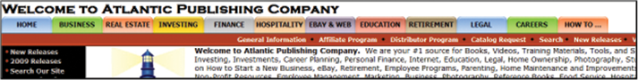
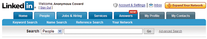
The most common navigation “styles” are explained below with image examples.
HTML links: Simple, efficient and great for search engines. Not as appealing as fancy buttons or other methods.
Breadcrumb trail: This system uses a single line of text to show a page’s location in the site hierarchy.
This should only be used as a secondary navigation system, however it is very useful to the site visitor to show where they are in a website’s hierarchy.
Navigation bars/buttons: By far the most common type of navigation.
Typically found on the left hand side of a Web page or across the top of a Web page.
Tab navigation: First made popular by Amazon, this can be considered a secondary navigation system; however, it provides a direct link to specific sections of a website.
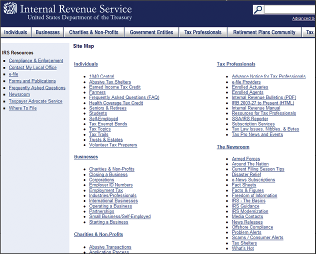
Site map: A single Web page which shows the complete navigation structure for your website. This is critical for SEO.
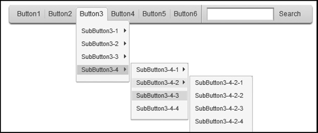
Drop-down menu: A menu, typically across the top or left hand side of a Web page that drops down or expands sub-menus as the mouse is moved over them.
This lets you put many links into the navigation, but they stay collapsed except when used.
These are typically made from JavaScript, DHTML, or CSS.
The bottom line is that simple, effective, user-friendly navigation is one of the most important elements of Web design.
I recommend you spend some time visiting other sites to get an idea of how different navigation methods are used.
This will not only give you great ideas for what to do, but it also helps you determine what to avoid.
Your navigation should be consistent throughout your blog.
If you use buttons and drop down menus, they should appear on every page and in the same location.
You should insert hyperlinks into your Web pages as another method; your visitors are familiar with hyperlinks and can easily recognize them when they’re embedded into Web pages.
Make sure your navigation system is “above the fold.”
Above the fold is a term taken from the newspaper industry, which means the “important” stories are placed above the fold in a newspaper and less important stories are placed below the fold where they are not seen when viewing the front page.
The concept translates to Web pages.
The following generic Web page image shows you how to successfully design your important content above the fold.
The main banner is on the top third of the page, which would showcase the name and objective of your blog.
To get to the posts, you can see that they are located in the middle of the page, which might warrant some slight scrolling, and to get to the other, less important information, the user must scroll to the bottom.
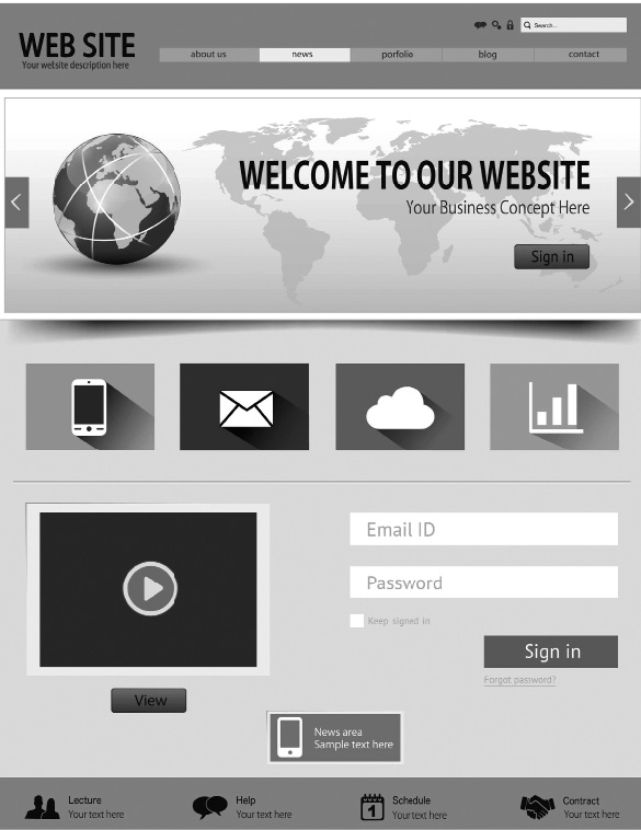
You only have so much real estate in a monitor, and you cannot always fit your entire page into the browser window.
Make sure your navigation systems are above the fold on a Web page — they should never have to scroll to find your navigation system.
Make sure you have a “Home” navigation link on every page. Give your site visitors an easy way to get back to the home page.
Make your navigation systems attractive through the use of graphics, images, and advanced features such as a rollover button that changes color when a mouse is moved over the item.
Blog Must-Haves
Blogs can be simple or complex. However, there are some basic attributes every blog should have.
A home page
This is typically the first page a site visitor will see, and it is the anchor of your site.
The focus of your design efforts should concentrate on your home page, and it should serve as the launch pad to other parts of your website.
Some blogs may use a splash or entry page before you hit the home page; typically these are done in flash as an “intro” page, and they can be quickly bypassed to get the visitor to the main site content.
This page must have defined navigation which is easy to find and easy to use.
You should have navigation links or navigation buttons, as well as excellent Web content that is keyword-rich and is easily read and understood by the blog visitor.
Search options
You have to have some form of search function on your blog.
This can be done with a site map as well as through additional applets from Google and other companies, which will index your Web pages and give you free search capabilities.
I recommend using the Google Custom Search Engine, which you can get here: https://cse.google.com/cse; however, there are many others you can find with a quick Web search.
A privacy policy
Internet users are becoming increasingly concerned with their privacy.
You should establish a “Privacy” Web page and let your visitors know exactly how you will be using the information you collect from them.
This page should address the following for your potential customers:
- For what purpose do you plan on using their information?
- Will their information be sold or shared with a third party?
- Why do you collect their email addresses?
- Do you track their IP addresses?
- Notify site visitors that you are not responsible for the privacy issues of any websites you may be linked to.
- Notify site visitors of your security measures in place to protect the misuse of their private or personal information.
- Provide site visitors with contact information in the event that they have any questions about your privacy statement.
An “about” page
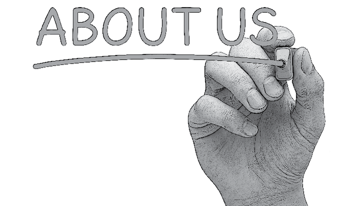
An “About Us” page is an essential part of a professional website for a variety of reasons.
Your potential customers may want to know exactly who you are, and it is a great opportunity to create a text-laden page for search engine visibility.
An “About Us” page should include:
- A personal or professional biography of you
- A photograph of yourself
- A description of you
- Your mission
- Contact information, including an email address
and social media links
A “feedback” page
There are many reasons to incorporate a feedback page into your blog.
There are times when your followers will have comments or suggestions for you, and even if you end up disagreeing, it can still be very helpful.
You can either do a separate feedback page, or you can just made a feedback widget where your followers can send in a comment.
Copyrighted material
You need to give credit to any and all material on your website that is not your own.
A simple link with credit to the photographer and a short note about the license is usually enough, but check with the original author to see if they have any special preferences.
Proper citation in accepted formats such as MLA is another one of the factors that search engines consider. This is one reason why Wikipedia® pages often get a high page rank.
Image leeching is considered bad manners in the world of Web development.
Never use an image from another website without the expressed written permission of the website owner to make sure you’re not violating any copyright laws.
There have been instances where the original image owner replaced the images with “Don’t Leech” signs.
The signs can appear on the leecher’s website without their knowledge, because the file link is still the same.
This could create a tarnished reputation of the website in question, since hundreds of users might notice the signs before the site developer does.
Hosting images on your own server will take the element of risk and surprise away from all important content crucial to your website.
You can find many free images online that are released under free and open licenses.
Look for images marked “copyleft” or those released under the Creative Commons License.
Be sure to read the license carefully to make sure you comply with the requirements listed before using the image for your website.